Playful Masonry: The LEGO-Inspired Children’s Hospital of Troy, Michigan
Words: David Biggs, Bronzella Cleveland, Amy Rosen

Photos: The Masonry Institute of Michigan
The new Children’s Hospital of Troy, Michigan was constructed with a variety of colorful bricks to mimic a LEGO structure, the goal? To create an inviting environment that’s less scary for kids.
Harley Ellis Devereaux (HED) in Southfield, MI, served as the architect for this $42 million project, a 63,000-sq.ft. outpatient-surgical facility for DMC Children's Hospital of Michigan. Located 20 miles north of the main Children's Hospital in Detroit, says Ronald Henry, DMC's Chief Facility Engineering and Construction Officer. Construction started in September 2014, with The Christman Company in Lansing, MI. acting as the construction manager.
The three-story facility opened in February 2016 and provides outpatient pediatric services such as cardiology, endocrinology, gastroenterology, nephrology, neurology, oncology and surgery. There is also a pediatric-only emergency room, with state-of-the-art imaging services.
While the facility was originally conceived to be “a very traditional, simple box” made out of a metal paneling system, the designers started to reconsider how the image would be perceived – and received — by kids, Henry says.
“We wanted a building that was extremely welcoming and identifiable by kids as a building that was for kids — and we involved many former patients, current patients, their family members, doctors, nurses in the design process,” he says.
The hospital worked with HED using the integrated facility design process to conceptualize this project. This process consisted of cardboard “city” being constructed on the base of an ice rink to layout the hospital floor-by-floor. “Ultimately we went through many different integrations and we built this particular building — full-size — out of cardboard before we actually built it out of real construction,” Henry says. “We rented an ice rink and we did one floor at a time. There was a time in the summer you could go to the ice rink, and you’d feel like you were walking through the first floor of this building.”

This was a trial and error period for the hospital to tailor the structure to the needs of its patients and their families. “A life-size mockup of each floor was made and we tested our design theory,” stated Luanne Thomas Ewald, CEO of Children’s Hospital of Michigan. “We had 21 guiding principles that we adhered to with our patients as our main focus.” Once the design was completed, the same floor-by-floor cardboard layout was constructed to finalize the detail of the interior of the hospital.
This process was done to drive out waste or excess space that didn’t have to necessarily be there. There were eight forms of waste addressed: motion, inventory, transportation, waiting, overproduction, over-processing, care admission process, and defects. All of these forms of waste were assessed in order to ensure there is efficiency in the hospital for the staff along with their patients.
“We wanted our buildings to be more efficient and we wanted to work smarter, not harder,” Ewald contends. “We wanted to make sure our processes and flow of patient care had the staff’s workflow in mind.”
With the interior design completed, there was still the task of the exterior being solidified. The primary exterior materials used on the Critical Care Tower are masonry and metal panel. The brand colors of the hospital are reflected in the metal panel fins across the curtain wall, the accent brick colors throughout the façade and the light block material used in each of the public lobbies, Ewald mentions.

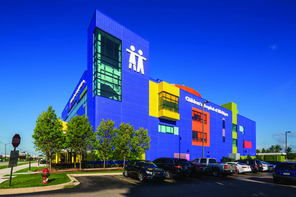
The team began to explore the idea of a masonry building to reduce overall project costs. “We noticed that older buildings with glazed brick looked good after many years, so we decided on glazed brick for the exterior,” Henry says. “Since we were looking for a building that was kid-friendly with color, we decided on special cut bricks that were very colorful. They sort of had a LEGO feel and so we just went with that.”
HED chose to use bricks manufactured by Glen Gery Corp. based in Wyomissing, PA., and distributed by Brick Tech Architectural Inc. in Berkley, MI. Schiffer Mason Contractors Inc. in Holt, MI. served as the mason contractor for the project.
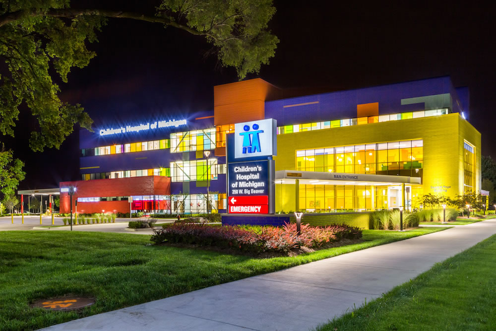
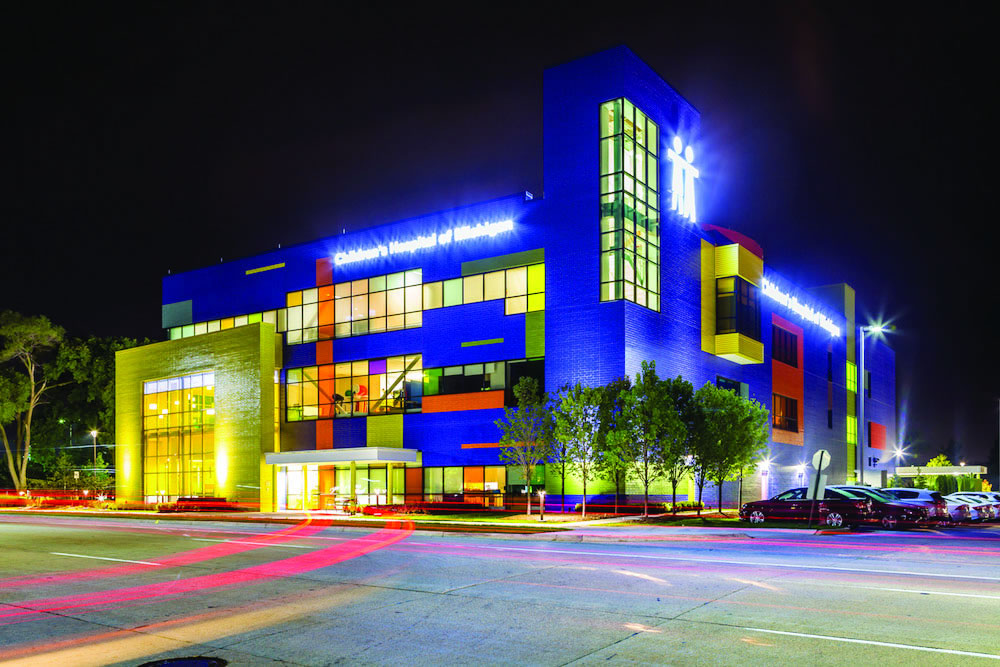
According to Glen Gery, the masonry was “a perfect material choice” for the Children’s Hospital of Troy MI., due to the variety of color, texture and scale. The exterior of the two-story main entrance lobby was made out of yellow block, the main three-story part of the facility comprising the primary outpatient services was made out of blue block, and the single-story emergency entrance was made out of yellow block.
“These simple moves of color, geometry and scale create a welcoming memorable image while providing a necessary visual way-finding tool for the anxious parent as they arrive with their ill child,” Glen Gery writes on its website.
The blue box is comprised of only utility brick to provide color variations within a uniform texture, the company writes. However, the yellow entrance and red emergency boxes employ one solid color each included Norman units with bands of custom utility units to create a variation of texture.
A total of 86,156! bricks in three sizes were used throughout the project, in a variety of Glen Gary colors — Dark Blue, Blue Bonnet, Forest Green, Mustard, Nikki Red, Orange and Lime.
Inside the facility, the welcoming interior design and child-focused environment create “a transformational experience for children with special medical needs that appears more suited as a big toy than a medical facility,” Glen Gery writes.
After construction started and the bricks were laid and cleaned, the contractors realized that all the different shapes had different finishes, Henry says. “It just didn’t look right, and so we struggled with what we were going to do,” he says. “Were we going to make the mason go back and tear all those [bricks] out, which would be a major undertaking?”

Instead, Glen Gery came to the project jobsite and applied a sealant to the bricks that matched the finish on all the other bricks, of which the manufacturer guaranteed for 50 years.
“The end product turned out perfectly, and now when you look at the blue bricks they all look identical,” Henry says. When the red bricks arrived, the glazing on the edges on were not quite finished, but fortunately Glen Gery was able to replace them with a better batch, he says.
Various coursing was used to add some banding to the building, Henry says. To break down the scale along the large blue expanses, horizontal banding with a different coursing was used. Virtually all of the building’s exterior was made of brick, with metal paneling on the other side.
“The whole concept of the building was to have it look like kids built the building out of LEGOs,” he says. “LEGO even created a replica of the hospital out of LEGO as a gift.”
Glen Gery writes that the use of color for the various functions of the facility creates “a fun memorable image not found in healthcare design while establishing a powerful branded image.”
“Seen as an animated visual beacon at night along a mostly dark stretch of road, during the day, the glass throughout the building is a colorful composition that not only coordinates with the brick masonry but brings the interior environment to life with a kaleidoscope of color, lighting and pattern creating a vibrant healing environment that nourishes the human spirit,” Glen Gery writes.